
Introduction
Previously on Timeline Connector Adventures: in Part 1 we laid the groundwork and defined the connector’s structure, and in Part 2 we tackled record fetching and filtering like responsible adults.
Now we move to the glamorous part of the job: rendering UI elements in a way that doesn’t look like a digital landfill.
In this post we’ll break down
- what the timeline control actually lets you draw,
- how to structure your getRecordUX() output so users don’t start a revolt,
- what it stubbornly refuses to support,
- and finish with the ancient developer tradition of complaining about platform gaps.
Timeline UI Anatomy (aka what pieces this control lets you draw)
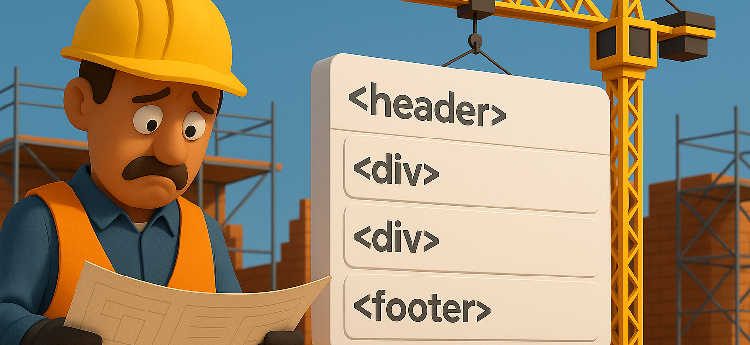
A timeline entry is basically a visual card living inside a scroll container it controls like a landlord. Each record you return gets rendered into a structure that (ideally) looks like this:
Top section (header):
- Primary record title
- Optional metadata tag (status, category, mood of the dev that built it)
Middle section (content/body):
- Short description preview
- Images or thumbnails (if your source even has them)
- Nested layout blocks for structure
Bottom section (footer):
- Timestamp (created/modified time)
- Optional secondary actions or link expansion
So realistically, the timeline card is composed in DOM terms roughly as:
You can ignore this clean hierarchy and render all text into one massive blob, but don’t. The control doesn’t clear your design sins, it just displays them.
Building visuals using context.factory.createElement()
To render anything on that card, you use the factory method provided by context, which constructs Fluent-compliant DOM elements the timeline control will accept without filing a restraining order.
context.factory.createElement(type, options, children)
Input types
| Parameter name | What does it do? |
| type: string | Name of the type of component (see below) that renders html component(s) |
| props?: object | Attributes or configuration for this element. Typically includes a key, className, or style depending on what you’re building |
| children: any | Nested elements or text nodes rendered inside the parent element. You pass them in sequence, not nested inside props. |
Wiat, but what is the type you ask? Well it’s nothing you would expect. Or perhaps, knowing Microsoft it is exactly what you’d expect – a custom and undocumented list of magic strings that work (or not). Here’s what I managed to dig out of the trash bin (no guarantees that it’s all, it works, is not deprecated etc.):
| Factory call type | Suggested props | Typical DOM result |
| “CRMIcon” | { key, className, iconName } | <span class=”ms-Icon”> |
| “EntityIcon” | { key, className, iconName, src? } | <span class=”ms-Icon”> or <img> |
| “MicrosoftIcon” | { key, className, iconName } | <span class=”ms-Icon”> |
| “PresenceIndicator” | { key, status? } | small <span> / badge <div> |
| “ProgressIndicator” | { key, value?, label? } | <progress> or loader <div> |
| “Container” | { key, className, style? } | <div> |
| “ScrollContainer” | { key, className, style? } | <div> with overflow |
| “HorizontalScroll” | { key, className, style? } | <div> with horizontal overflow |
| “Popup” | { key, className, style? } | <div role=”dialog”> |
| “LivePersonaCardHoverTarget” | { key, className } | <div> hover wrapper |
| “Button” | { key, className, style?, disabled? } | <button> |
| “Hyperlink” | { key, href, className, style?, target? } | <a> |
| “IMG” | { key, src, className, alt?, width?, height? } | <img> |
| “Image” | { key, src, className, alt? } | <img> |
| “EntityImage” | { key, src, className, alt? } | <img> |
| “TextInput” | { key, className, value?, placeholder? } | <input> / <textarea> |
| “Text” | { key, className, style? } | <p> or <div> text node |
| “TextBlock” | { key, text, className?, style? } | <p> or <div> |
| “Label” | { key, className, text } | <label> or <span> |
| “List” | { key, className, style? } | <ul> / <ol> |
| “ListItem” | { key, className, style? } | <li> |
| “Table” | { key, className, style?, width? } | <table> |
| “TableBody” | { key, className } | <tbody> |
| “TableHeader” | { key, className } | <thead> |
| “TableFooter” | { key, className } | <tfoot> |
| “TableRow” | { key, className?, style? } | <tr> |
| “TableCell” | { key, className?, style? } | <td> |
| “TableCellIcon” | { key, className?, style?, src? } | <span> or <img> inside <td> |
| “TableHeaderCellText” | { key, text } | text / <span> in <th>/<td> |
| “Select” | { key, className?, style? } | <select> |
| “Option” | { key, value } | <option> |
| “ComboBox” | { key, className?, options? } | composite dropdown <div>/<select> |
| “Radio” | { key, checked?, name? } | <input type=”radio”> |
| “Boolean” | { key, checked } | <input type=”checkbox”> |
| “FileInput” | { key, accept? } | <input type=”file”> |
| “IFrame” | { key, src, className? } | <iframe> |
| “Placeholder” | { key, className?, style? } | <div> or <span> skeleton block |
What this means:
- “Container” is just your <div> landlord.
- “Label” becomes a semantic <label> or styled <span>.
- “TextBlock” contains the text node that becomes paragraph or block text.
- “Image” with “IMG” variants becomes <img>, so use it for icons or timeline thumbnails.
- “Button” becomes <button>, so yes, you finally have a clickable thing.
- “Table” becomes <table> and follows normal row/cell parenting.
Now that we have it, we can finally dive into building something that actually looks like it had a design, and more importantly, can be implemented without making future-you cry. The factory gives you the raw ingredients, but you’re still the one cooking, so now the goal is to architect a UI structure that feels native to the timeline control while still translating external data into DOM-safe visual blocks. With the outline and mapping nailed down, we can move from theory into the part that resembles real engineering: rendering the header, body, and footer containers into HTML elements using createElement().
I like to keep everything in order, so I will move the implementation of UI elements to another file, but that’s not necessary.
Our method will look like this:
As you see, each time the getRecordUX is called we’re returning a timelineRecord. Each record should (must?) contain commands, header, body, footer, icon etc. We’ll go through each of those in this article starting with header:
Plain and simple, we add a label using createElement(“Label”, …) and that’s it. We can use the isExpanded flag to show more information if the record is expanded, or collapsed.
For the body we’ll try something fancy: I’ll add some buttons and a table when the record is expanded. Please take a look on how we embed components into one another. Is it good? No. Could it work better? Definitely. I would assume one could imagine inserting a ready html component with css files designed by someone who actually has a taste and not a developer like myself.
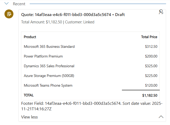
And here’s how it looks like expanded:
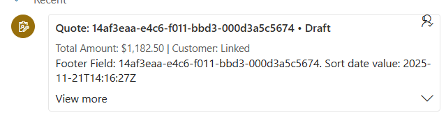
and collapsed:
There’s just one small problem if you’ll try to copy-paste the above code. The compiler will scream in terror! The createElement method is not accepting an array as the third parameter! This is a mistake on Microsoft side, here’s the correct definition that you should put in the d.ts file:
interface IFactory{
   createElement(element: string, options: any, data?: any) : any;
}
Now nothing stops you from doing beautiful renderings full of components added via createElement method with inline styles! With perhaps the last thing that is really annoying. Icons. But we will cover that in another post.
I also said that we’ll cover everything related to the UI, but honestly there’s so much more we need to do, I’ll cover that in the next post.
happy coding!

